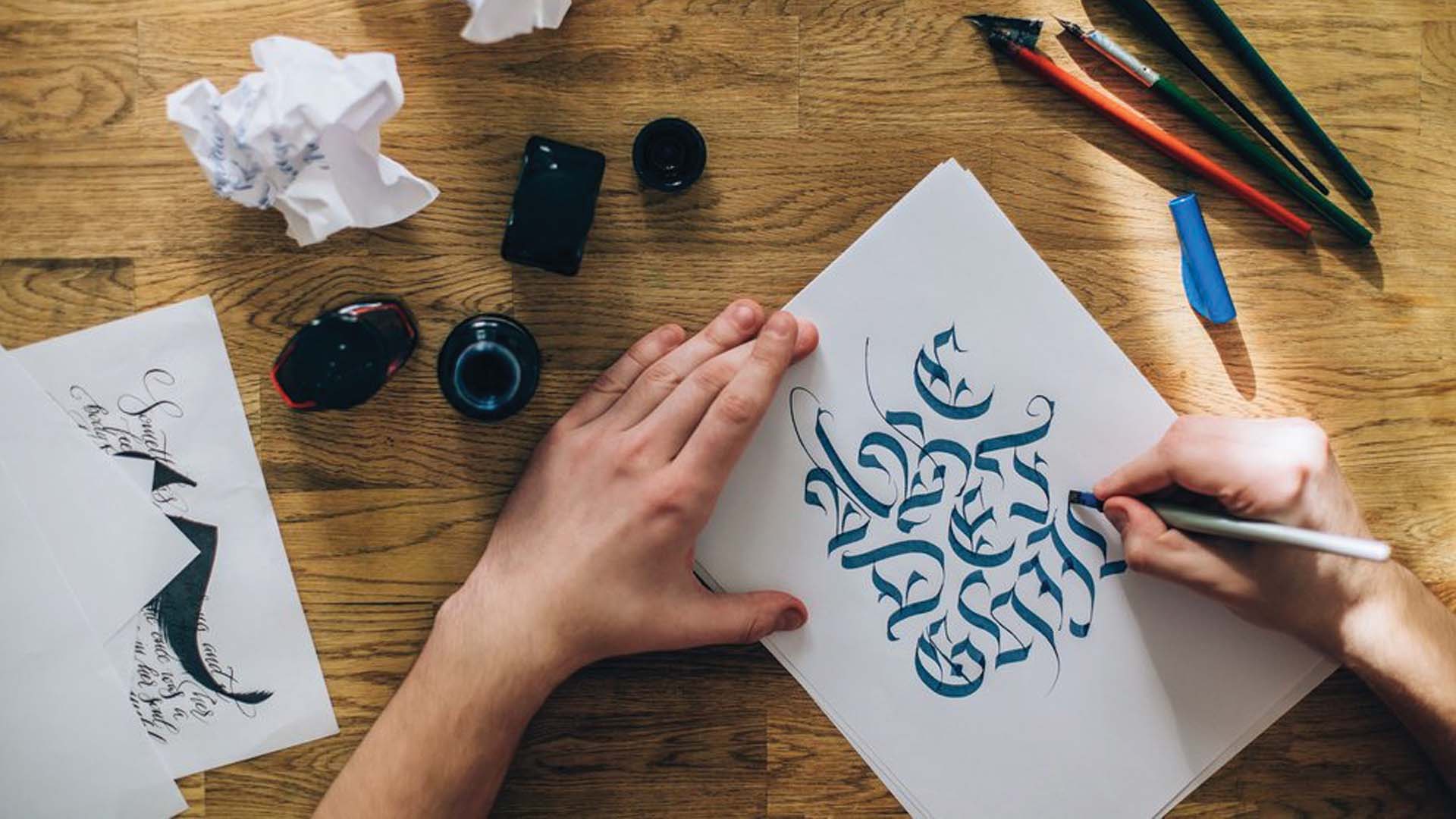
You dip your brush into the ink then lift it up and bring it down, pressing it lightly to the page. Brush strokes dance back and forth between light and heavy lines, curving and twisting slowly into perfect shapes and symbols. It may sound like we’re describing someone painting, but we’re actually describing a different form of art- calligraphy. Though some of us may only have the artistic talent to write in chicken-scratch scrawl, there are many out there who continue to turn handwriting into an art.

The term calligraphy, or the art of beautiful handwriting, has its roots and origins in many different countries around the world. It’s most commonly associated with China as that’s where it’s believed to have originated, but different forms were created in various countries around the world including Japan, India, Tibet, and Europe.
In East Asian countries such as China, Japan, Vietnam, and Korea, this form of art began with pictograms and ideographs made on the surfaces of jades and oracle bones. In India, however, calligraphy first appeared as a way to ‘print’ holy texts (similarly to its European origins). According to Entity Mag, this style is thinner and more fluid than that of the East Asian style, though it was influenced by Persian and Arabic styles. Predictably, we’re most familiar with the European version of calligraphy, which is the style of writing found in the King James version of The Bible. This style was reserved for penning religious texts and expressing art in various forms.
Although calligraphy has been around in some form for roughly 3,000 years, the word wasn’t used as a distinction until around the mid-15th century after the introduction of printing in Europe. This was when a clear distinction was created between normal handwriting and more elaborate forms of script writing. One may assume that the creation of printing ended the tradition of hand-written books, but according to Brittanica, publications such as musical scores, scientific notation, and other specialized works continued to be handwritten well into the 19th century.

Nowadays, although you’ll see various styles, you can categorize calligraphy as either traditional or modern. Modern calligraphy is considered to be any type of calligraphy that doesn’t follow the structural rules of traditional calligraphy styles (such as Copperplate, Spencerian, Italic, Blackletter, etc.). Traditional styles, as you can imagine, have been developed over time and are meant to be an exact science. Each letter has a specific height, angle, measurement, and tool(s) required to accomplish it. And it’s only considered to be indicative of that particular style if the letter matches these requirements precisely.
On the other hand, what is now considered modern-day calligraphy is a little more free form. It’s not about matching a specific style and gives the artist more freedom to play around and create their own unique forms, with a higher variance on shapes and tools used. However, just because it’s more open to interpretation doesn’t mean you can just scribble letters on a page and call it calligraphy. There are a few things that are generally considered to be indicative of calligraphy vs. fancy penmanship.
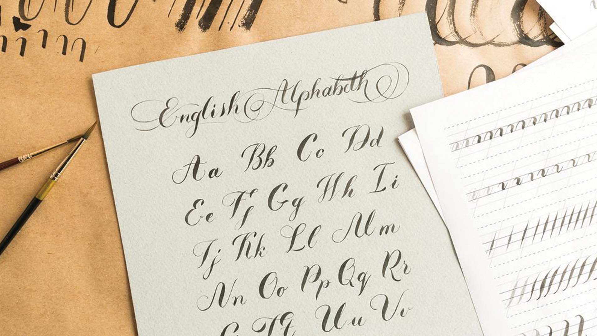
Firstly, you need the proper tools. According to Lettering Daily, modern calligraphy requires you have either brush pens, classic dip pens, pencil, markers, or broad nib pens. One of the indicators of calligraphy is knowing how to balance your thin strokes with your thick strokes. As a general rule of thumb, your strokes going up on the page should be thin while your strokes going down should be thick. Another major indicator of calligraphy is consistency. You’ll want to try to keep your letters consistent in size, shape, and brush strokes to increase the overall visual harmony of the page. There are warmups you can do to help you get to know the basics of brush strokes, as illustrated in the video below:
Spacing is also important to the visual harmony of your page because you don’t want your letters to be so squished together that they can’t be clearly read. And, finally, balance your page out in terms of the contents. You don’t want the page to feel uneven, with one side heavy with words and the other with very few.
Although styles have morphed and expanded exponentially over the course of thousands of years, calligrapher’s all around the world continue to inspire us with their ink-credible artwork!
Learn more about the World of Creation, and discover the history of pottery, anamorphosis art, and ancient painting.


