As the Divisional Round of the playoffs begins, the path to Levi’s Stadium is getting tighter. For the first time in years, though, the destination isn’t marked by just the favorites’ colors. This time, it’s covered in every color.
It’s been 11 months since the NFL revealed the Super Bowl LX (60) logo. Now, as the branding appears all over Santa Clara and San Francisco, it’s a good time to look back at the design that finally ended the internet’s favorite conspiracy theory.
The “Anti-Conspiracy” Palette
For almost five years, NFL fans believed in the “Logo Color Theory.”
- SB LVI: Orange and Yellow? Bengals vs. Rams.
- SB LVII: Green and Red? Eagles vs. Chiefs.
- SB LVIII: Red and Purple? Chiefs vs. 49ers.
The pattern was so consistent that it became a meme: the script was written in the logo. Then came February 10, 2025.
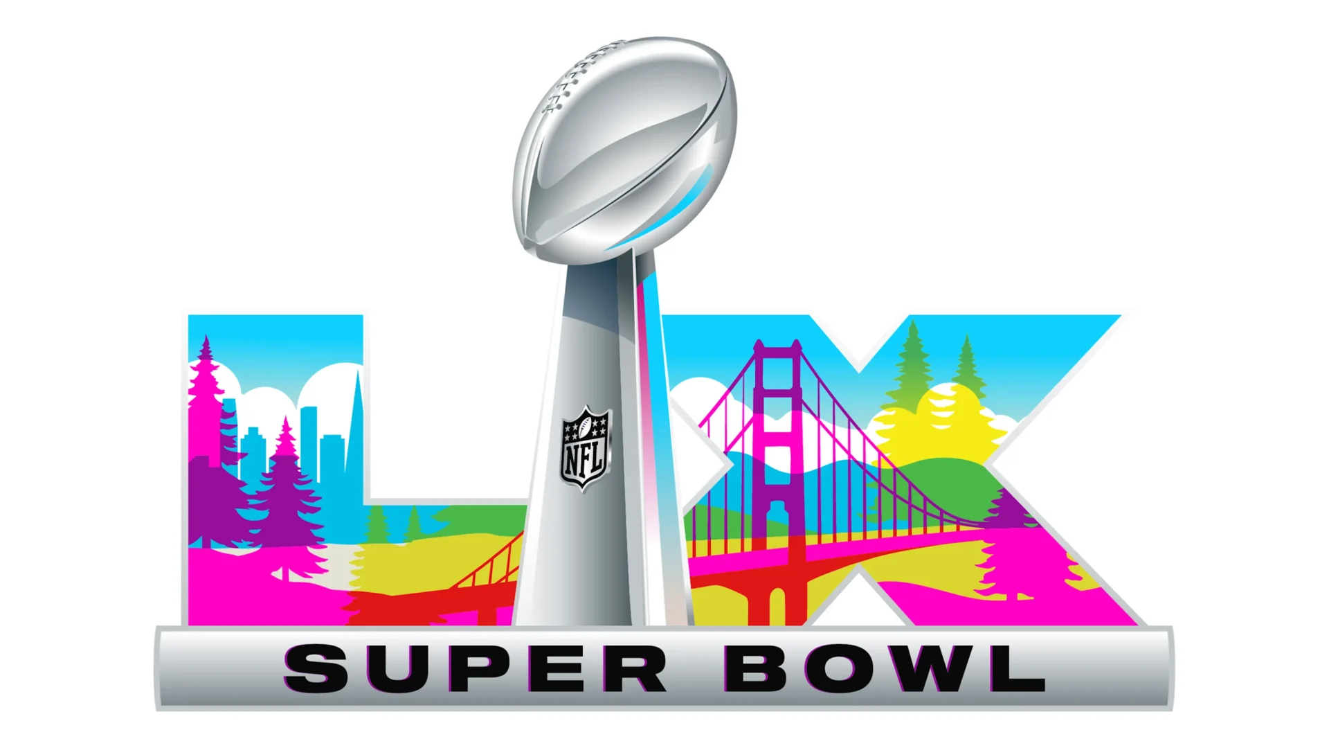
The morning after Super Bowl LIX, the league released the Super Bowl 60 branding, and it looked like a shattered prism. The design features a bold, high-contrast gradient that begins with magenta and deep purple at the bottom, transitions to royal blue and cyan, and concludes with golden yellow and International Orange. Essentially, every color in the visible spectrum (CMYK), the NFL didn’t just design a logo; they trolled the predictors. As one Reddit user famously posted last year: “The NFL really said ‘Everyone vs. Everyone’.”
Silicon & Redwoods: Deconstructing the Design
Besides the colors that break the old theories, the logo is also a tribute to the two sides of the Bay Area.
Advertisement
The standard “Template Era” look, with the Lombardi Trophy and Roman numerals, is still there. But Super Bowl LX has its own unique style.
The Bridge: The crossbar of the “L” and the “X” is shaped by the outline of the Golden Gate Bridge, shown in its famous reddish-orange color.
The Forest: The numbers aren’t just metallic, they’re surrounded by stylized Coastal Redwoods in teal and forest green, connecting the high-tech event to Northern California’s natural roots.
The Glow: The sunset gradient isn’t just for looks. It’s designed to remind people of the West Coast’s “Golden Hour” and the bright digital screens of Silicon Valley in Santa Clara.
Does the Prophecy Hold?
Now, in January 2026, does the “Rainbow Logo” actually tell us anything?
Surprisingly, yes. Since the logo has so many colors, almost every team still in the playoffs can say it “predicts” them.
- The Purple: Ravens and Vikings fans are pointing to the base of the logo.
- The Teal/Aqua: Dolphins fans claim the middle section is a clear nod to Miami.
- The Red/Gold: The 49ers, the host team, are obviously represented by the bridge and sunset.
- The Blue/Silver: Lions and Bills fans see their “Honolulu Blue” and “Royal Blue” in the sky gradient.
For the first time in years, the Super Bowl branding feels truly neutral. It’s not a “script” hinting at two teams; it’s a spectrum. As the Divisional Round starts this weekend, that seems just right.
The road to the Super Bowl is usually simple and clear. This year, it’s full of color.