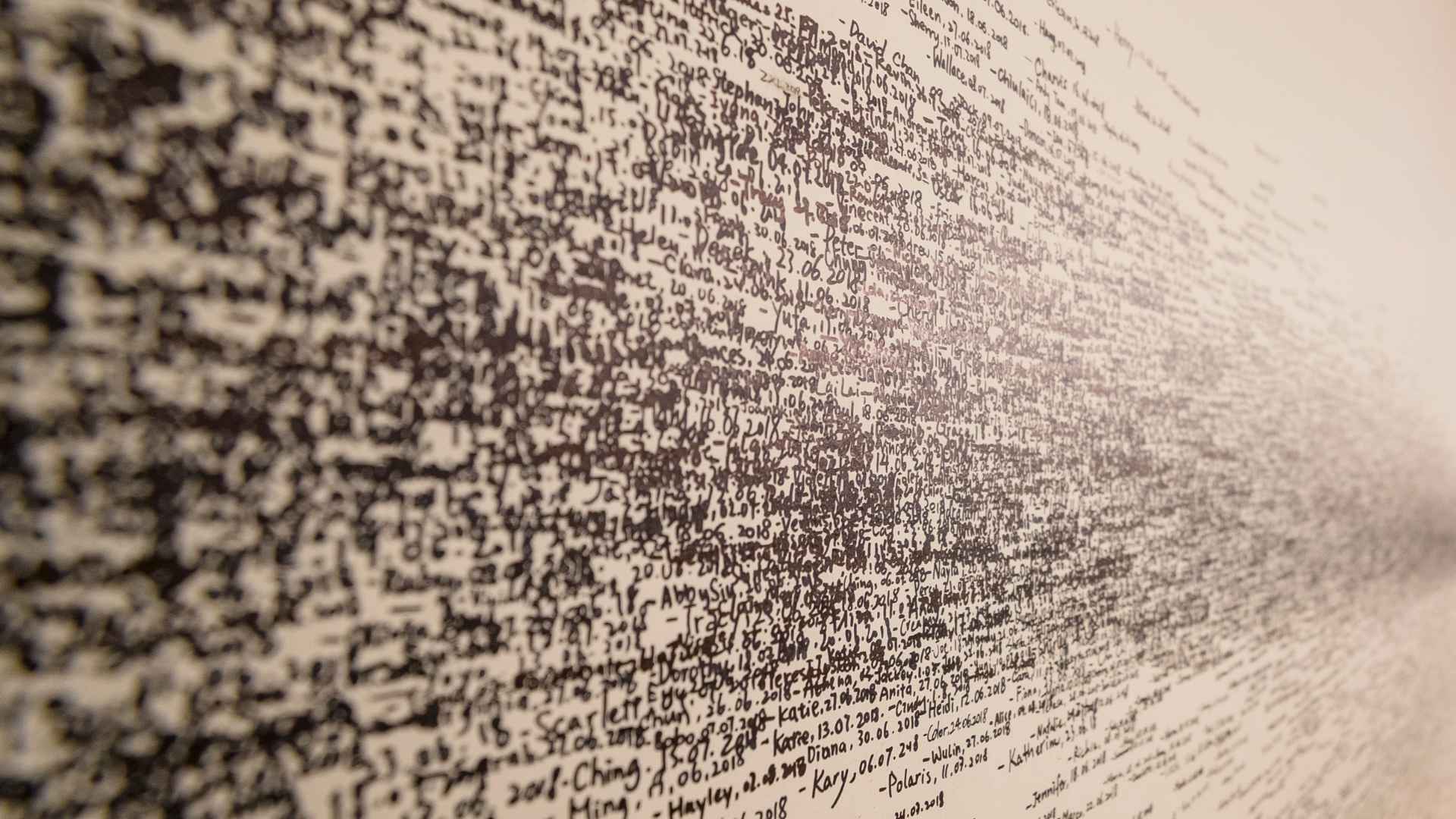
Most people think of data as numbers on a screen. It’s charts, graphs, spreadsheets, and statistics. Useful, yes. Beautiful? Not usually. But a growing number of artists, designers, and scientists are changing that idea. They’re turning data into art, creating works that help people see information in a completely different way.
The concept is simple. Large sets of information are translated into visual forms such as sculptures, digital displays, paintings, and interactive installations. The result is artwork that is based on real data but designed to connect with people on an emotional level.
Seeing Information in a New Way
Imagine looking at decades of climate records and seeing them transformed into a flowing sculpture. Or viewing data from distant galaxies displayed as a colorful digital landscape. The information itself hasn’t changed. What changes is how people experience it.
This approach is becoming increasingly popular in fields such as climate science, healthcare, astronomy, and artificial intelligence. Researchers often work with massive amounts of information that can be difficult for the public to understand. Art offers another way to tell the story.
One famous example is the use of climate data in visual installations that show rising temperatures over time. Instead of reading a report, visitors can see patterns emerge before their eyes. For many people, that experience feels more personal.
Advertisement
Where Creativity Meets Technology
The process requires both artistic vision and technical skill. Artists may work with computer programmers, engineers, scientists, and data analysts to build their projects. Some use artificial intelligence to help organize information. Others use custom software to create visuals that would be impossible to draw by hand. The final piece often becomes a bridge between two worlds.
Science focuses on understanding facts. Art focuses on helping people feel connected to those facts. Together, they can make complex subjects easier to understand. That’s important because we live in a world filled with information.
Every day, satellites collect data about Earth. Telescopes gather information from deep space. Sensors track weather patterns, ocean temperatures, and air quality. Most of that information remains invisible to the average person. Data art gives it a form we can see.
Finding Beauty in Knowledge
Perhaps the most inspiring part of data art is what it reveals. Hidden inside numbers are stories about our planet, our communities, and the universe itself. Artists help bring those stories to life. The next time you see a chart or graph, remember that behind every number is a piece of a much larger picture. And sometimes, with a little creativity, information can become something more than data. It can become art.